
geaeebooindfocegjgdfjkbmkekcpobd
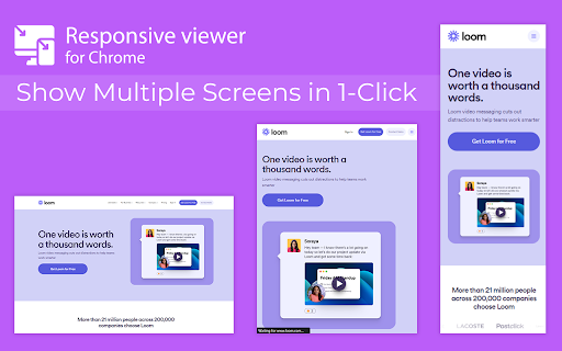
View multiple screens simultaneously With Responsive viewer For Chrome In 2025, ensuring your website looks flawless across all devices is more important than ever. Don’t let your website look ugly when viewed in different devices, you can use Responsive Viewer for Chrome extension. As a device necessary for developers, you have the ability to display several sizes on the screen at once, which makes testing of work in responsive design faster. With two to three clicks, assess and improve broad site structure across different screens, for the best usability. Multiple Screens in One View: See all the screen resolutions on one page, from mobile-first to desktop-first, if you want to test responsiveness. Quick Layout Assessments: Exhibit 2 A time saver delivering layout problems in real time respecting device, screen and orientation. Customizable Configurations: Make your screens, specific resolutions, and spatial orientations correspond with the intended devices. Enhanced Development Workflow: Be able to easily identify and address problems regarding responsiveness in order to enhance the design operation. Install the Extension: To get the Responsive Viewer Chrome Extension, go to Chrome Web Store and install it. Open the Website or App: Open the website or the application that you wish to and it ready for testing. Activate Responsive View: In your Chrome bar you will see the icon of Responsive Viewer. Customize View: Orientation and scaling and resizing options are available to help the user in specific and more detailed forms of testing. Review and Optimize: Make sure that the same layout appears uniformly in all your displays and adjust your site in terms of how well it is user-friendly on each of the devices. Test with Ease: To minimize discrepancies in performance across different devices, the configurations have to vary. As was described, the Responsive Viewer is intended to simplify the work of testing responsiveness. Developers and designers can now check how their designs work on various devices without flipping between screens. Cut hours off your schedule, make your work more efficient, and make your users’ experience on any device seamless. What is the Responsive Viewer extension? The Responsive Viewer is a Chrome extension that allows developers to view multiple screen resolutions simultaneously, making it easier to test website responsiveness. Can I customize screen sizes and orientations? Yes, you can easily customize the screen sizes, orientations, and resolutions to match the devices you’re testing. Yes, the Responsive Viewer is free to install and use for all Chrome users. Does this work with any website? Absolutely! You can test responsiveness on any website or web application by simply activating the extension. Who can benefit from this extension? Web developers, designers, and anyone working on responsive web designs will find this tool invaluable for quick and accurate layout testing.

Responsive Website Testing Toolkit - Multiple Viewport Simulator
An essential tool to test the responsiveness of any website on multiple screens simultaneously Simplify your web development and testing journey with Responsive Website Testing Toolkit, a comprehensive solution built to enhance testing, collaboration, and project organization. An advanced multi-device responsiveness testing tool that empowers developers and designers to work smarter and faster. 1. Test Responsiveness Across Multiple Viewports Simultaneously Instantly preview your website on multiple devices in real time. Responsive Website Testing Toolkit lets you view layouts on smartphones, tablets, desktops, and more, helping you deliver pixel-perfect designs for every screen size. 2. Sync Mouse Clicks and Scroll Events Across Viewports Test interactivity like never before! Sync mouse clicks, and scroll events across all viewports simultaneously, ensuring a seamless user experience across devices. 3. Customizable Viewports for Every Need Design and test for any screen size with ease. ResponsiveSync Pro allows you to create custom viewports tailored to unique device requirements, giving you the flexibility to tackle any project. 4. Workspaces for Efficient Project Management Stay organized with dedicated workspaces for every project. Manage viewports, configurations in a single, user-friendly interface, making multi-project management a breeze. 5. Export and Import Projects and Settings Seamlessly collaborate with your team or transfer projects between environments. Responsive Website Testing Toolkit supports exporting and importing projects and settings, ensuring continuity and productivity across your workflow. 6. Capture Screenshots Instantly Document and share progress with one-click screenshot capabilities with or without the device Mockup. Besides above mentioned key features there are more features to explore. We are actively working to introduce new features in a regular interval and improve the quality of the application. ✅ Save Time: Simultaneous multi-device testing accelerates your workflow. ✅ Work Smart: Advanced features like synced actions and project exports boost efficiency. ✅ Be Flexible: Customize viewports and configurations to fit any requirement. ✅ Stay Organized: Streamline project management with intuitive workspaces. Take your responsive web development and testing to the next level with Responsive Website Testing Toolkit, the all-in-one tool that delivers precision, flexibility, and convenience. For any suggestions or feature request please reach out to us via the email which mentioned in the developer info.

Responsive Viewer
View any webpage in different device dimensions with custom sizing Responsive Viewer helps developers and designers test webpage responsiveness across multiple device sizes. Key Features: • Pre-configured device presets (Desktop, Laptop, Tablet, Mobile, etc.) • Custom dimension input • Quick rotation button • Zoom controls • Dark/Light theme • Keyboard shortcuts • Pixel grid overlay • Measurement tools • Smooth animations and transitions Perfect for: • Web Developers • UI/UX Designers • QA Engineers • Anyone testing responsive designs

Mobile simulator - responsive testing tool
Smartphone and tablet simulator on computer with several models to test mobile responsive websites. 🚀 Simulate mobile viewports, check responsive web design, create impactful client demos, and save hours of testing. Mobile FIRST is the most powerful and reliable responsive simulator extension, trusted by developers and designers for over 5 years. Our rating on the Chrome Store speaks for itself! 📱 PRE-CONFIGURED DEVICES (New ones added regularly) • 58+ devices ready to use out of the box • 45 smartphones (old and recent models) • 5 tablet models • 11 special devices (smartwatches, kiosks, desktop...) 🔥 NEW & MAIN FEATURES • 📱📱 Multi-device comparison: View and test multiple devices side-by-side simultaneously for faster responsive checks • 🛠️ Custom devices: Create and save your own devices with custom screen resolutions and viewports • 👆 Realistic touch scrolling: Simulates native finger gestures for an authentic mobile browsing feel • 🎬 One-click video capture (WEBM, GIF, MP4) for your demos and tutorials • 📸 Transparent PNG screenshots, perfect for client emails or presentations • 🌚 Dark mode for enhanced visual comfort ✨ Inside Mobile FIRST, many technical tricks are integrated to reproduce the mobile experience as closely as possible. (Note: While highly accurate for day-to-day dev, this simulator does not replace final testing on a real device for 100% full validation.)

Responsive Buddy
Test mobile layouts of your web pages in 2 clicks. As a web developer, I need to constantly check my designs on large and small screens. I tried many Chrome extensions that test responsive designs, but most of them were too bloated or inconvenient. So I created my own. I've been using it daily, so I thought – why not publish it, maybe it will be useful for you too! Most extensions require that I configure my own list of favorite devices. Responsive Buddy offers 3 phone and 3 tablet sizes, from small to large. Useful if you want to compensate the difference between your monitod DPI (pixel density) and the DPI of a target mobile device. Switch between portrait and landscape orientation with a click of a button. By default, Responsive Buddy creates a window with an iframe, then transforms it to the selected zoom setting. It works well, unless your website refuses to be opened in an iframe. If that's the case, you can turn "iframe mode" off. Your eyes will thank you!