
pkpodanfippddohhfchdmebebbepjkkf
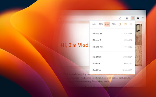

Test mobile layouts of your web pages in 2 clicks. As a web developer, I need to constantly check my designs on large and small screens. I tried many Chrome extensions that test responsive designs, but most of them were too bloated or inconvenient. So I created my own. I've been using it daily, so I thought – why not publish it, maybe it will be useful for you too! Most extensions require that I configure my own list of favorite devices. Responsive Buddy offers 3 phone and 3 tablet sizes, from small to large. Useful if you want to compensate the difference between your monitod DPI (pixel density) and the DPI of a target mobile device. Switch between portrait and landscape orientation with a click of a button. By default, Responsive Buddy creates a window with an iframe, then transforms it to the selected zoom setting. It works well, unless your website refuses to be opened in an iframe. If that's the case, you can turn "iframe mode" off. Your eyes will thank you!

Pixefy - Responsive Design Checker
Preview and debug your website’s responsiveness across multiple devices in real-time, all inside one browser tab. Pixefy helps you spot layout issues instantly and fine-tune designs with live editing tools – right as you build. It simplifies responsive testing by letting you preview, debug, and edit across multiple screen sizes in one place – no more switching tabs or resizing windows manually. ✔️ 🟢🟠 Live Responsive Previews – Test across multiple screen sizes side-by-side. Scroll, click, and interact on all screens simultaneously. Match real devices with optional browser bars + native UI spacing. ✔️ 🟠 Custom Screens & Presets – Create and save your own breakpoints, or use popular device resolutions out of the box. ✔️ 🟢 Screen Management – Rearrange, stack (horizontal/vertical), rotate, or zoom screens globally for a flexible workspace. ✔️ 🟢🟠 Inspect & X-Ray – Inspect styles, edit attributes live, and debug layouts with Visual Box Model, grids, and X-Ray overlays. ✔️ 🟢🟠 CSS Debugging Tools – View/edit computed styles, measure distances between elements, compare two elements, and track all changes in the Activity Tab. ✔️ 🟠 Content Editing – Instantly replace text or images, and check word/character counts directly on the page. ✔️ 🟠 Asset Downloads – Extract SVGs, PNGs, and other assets directly from Inspect Tool tabs. ✔️ 🟢 Screenshots & Annotations – Capture full pages, visible areas, or selected regions, then add notes, arrows, and highlights for clear, shareable feedback. ✔️ 🟠 User Agent Switching – Simulate different devices, browsers, or bots to see how your site adapts. ✔️ 🟠 Accessibility Tools – Test AA/AAA contrast ratios, extract all colors, and preview vision impairments with blindness simulations. ✔️ 🟢 Utilities – Live Dimension Widget (viewport width/height), copy any value or asset to clipboard, clear cache & refresh Pixefy. ✔️ 🟠 Themes – Switch between website's light and dark mode instantly. ✔️ 🟠 SEO Overview – Get a quick overview of key on-page SEO elements, including titles, meta descriptions, headings, and other essential page data. ✔️ 🟢 Touch Simulation – Simulate touch interactions to preview how websites behave on touch-based devices.

Responsive viewer For Chrome
View multiple screens simultaneously With Responsive viewer For Chrome In 2025, ensuring your website looks flawless across all devices is more important than ever. Don’t let your website look ugly when viewed in different devices, you can use Responsive Viewer for Chrome extension. As a device necessary for developers, you have the ability to display several sizes on the screen at once, which makes testing of work in responsive design faster. With two to three clicks, assess and improve broad site structure across different screens, for the best usability. Multiple Screens in One View: See all the screen resolutions on one page, from mobile-first to desktop-first, if you want to test responsiveness. Quick Layout Assessments: Exhibit 2 A time saver delivering layout problems in real time respecting device, screen and orientation. Customizable Configurations: Make your screens, specific resolutions, and spatial orientations correspond with the intended devices. Enhanced Development Workflow: Be able to easily identify and address problems regarding responsiveness in order to enhance the design operation. Install the Extension: To get the Responsive Viewer Chrome Extension, go to Chrome Web Store and install it. Open the Website or App: Open the website or the application that you wish to and it ready for testing. Activate Responsive View: In your Chrome bar you will see the icon of Responsive Viewer. Customize View: Orientation and scaling and resizing options are available to help the user in specific and more detailed forms of testing. Review and Optimize: Make sure that the same layout appears uniformly in all your displays and adjust your site in terms of how well it is user-friendly on each of the devices. Test with Ease: To minimize discrepancies in performance across different devices, the configurations have to vary. As was described, the Responsive Viewer is intended to simplify the work of testing responsiveness. Developers and designers can now check how their designs work on various devices without flipping between screens. Cut hours off your schedule, make your work more efficient, and make your users’ experience on any device seamless. What is the Responsive Viewer extension? The Responsive Viewer is a Chrome extension that allows developers to view multiple screen resolutions simultaneously, making it easier to test website responsiveness. Can I customize screen sizes and orientations? Yes, you can easily customize the screen sizes, orientations, and resolutions to match the devices you’re testing. Yes, the Responsive Viewer is free to install and use for all Chrome users. Does this work with any website? Absolutely! You can test responsiveness on any website or web application by simply activating the extension. Who can benefit from this extension? Web developers, designers, and anyone working on responsive web designs will find this tool invaluable for quick and accurate layout testing.

Responsive Tester
Test responsive web designs or mobile pages and see if it is mobile friendly Test responsive web designs or mobile pages that detect specific user agents. Test multiple devices at the same time! The Mobile/Responsive Tester extension allows Developers to test their web pages against common mobile, phablet and tablet devices by emulating the user agent and screen resolution. Excellent for testing responsive web designs. Easily switch between portrait and landscape mode and test multiple mobile device's at the same time! To begin using the software, install our extension. Navigate to the webpage you wish to test for different resolution sizes. Click on our software extension icon, and then choose the resolution size.

Mobile View: Test responsive designs fast
Test your responsive designs on multiple devices at once. See your website on multiple devices at once with live updates, even for locally hosted sites. Hot module reloading ensures instant code changes across all devices, while synchronised scrolling and navigation lets you test seamlessly across any website. Perfect for: ----- ✅ Full-Stack & Front-End Developers ✅ UX/UI Designers ✅ Anyone using Polypane/Blisk/Responsively/Sizzy Get started in seconds: ----- ✅ Install Mobile View from the Chrome Web Store. ✅ Click the extension icon to activate it. ✅ Select devices and breakpoints for continuous testing. ✅ Start developing - changes appear instantly! Join the future of responsive design testing and quality assurance. Works with all your favourite frameworks. Try Mobile View today and revolutionise your development process!