
ckejmhbmlajgoklhgbapkiccekfoccmk


Smartphone and tablet simulator on computer with several models to test mobile responsive websites. 🚀 Simulate mobile viewports, check responsive web design, create impactful client demos, and save hours of testing. Mobile FIRST is the most powerful and reliable responsive simulator extension, trusted by developers and designers for over 5 years. Our rating on the Chrome Store speaks for itself! 📱 PRE-CONFIGURED DEVICES (New ones added regularly) • 58+ devices ready to use out of the box • 45 smartphones (old and recent models) • 5 tablet models • 11 special devices (smartwatches, kiosks, desktop...) 🔥 NEW & MAIN FEATURES • 📱📱 Multi-device comparison: View and test multiple devices side-by-side simultaneously for faster responsive checks • 🛠️ Custom devices: Create and save your own devices with custom screen resolutions and viewports • 👆 Realistic touch scrolling: Simulates native finger gestures for an authentic mobile browsing feel • 🎬 One-click video capture (WEBM, GIF, MP4) for your demos and tutorials • 📸 Transparent PNG screenshots, perfect for client emails or presentations • 🌚 Dark mode for enhanced visual comfort ✨ Inside Mobile FIRST, many technical tricks are integrated to reproduce the mobile experience as closely as possible. (Note: While highly accurate for day-to-day dev, this simulator does not replace final testing on a real device for 100% full validation.)

CSS Peeper
Inspect website styles in seconds. Supercharge your workflow, and save hours of work. CSS Peeper is the ultimate Chrome extension for designers and developers who want a seamless way to inspect and extract design properties from any website. Say goodbye to digging through complex code. CSS Peeper provides an intuitive, organized interface to access key design details. Professionals deserve tools that save time. Let CSS Peeper streamline your workflow and help you work smarter, not harder. Join 500,000+ professionals who are already making the most of their time. Supercharge your workflow with advanced design inspection features and save hours of work. No more digging in a code. 👉 Get CSS Peeper for Free! Install now and start inspecting websites in seconds. Visit https://csspeeper.com for more details. ✦ Inspect design properties effortlessly. Stop digging through the code. Save hours by quickly inspecting element properties with a simple point-and-click. ✦ Explore colors used on your favorite sites. Browse a variety of colors, find inspiration, and easily check contrast. Love a palette? Export it to your favorite design tool. ✦ Identify typography. Explore the typography across any site, uncover unique font pairings, and check the most relevant text properties. ✦ Explore assets. Browse and download all images, icons, and graphics used across a website. ✦ Instantly preview and copy the CSS of any element, turning great design into reusable code. ✦ Browse and explore the typography in use on any website. Preview the typography hierarchy to understand font choices, sizes, and styles, helping you design confidently and efficiently. ✦ Effortlessly identify typography instances and gain deeper insights into font style applications. Navigate to a dedicated screen to inspect each type of style with precision. ✦ Browse colors by semantic grouping including typography, background, border, and more. Identify colors in context to get more insights. ✦ Inspect individual color instances and explore their use cases, including value, category, class, and design token. ✦ Explore gradients color by color and preview every shade to recreate stunning visual effects with precision. ✦ Contrast scanner helps you stay aligned with the best accessibility practices. Instantly assess contrast issues, ensuring your websites are beautiful and accessible. ✦ Smart Inspector offers an advanced way to inspect design details at a glance. It provides deeper insights into design properties, including color contrast, shadows, and elevation effects. ✦ Switch to Sidebar Mode to gain full access to the website’s viewport. You can see the full list of available features at https://csspeeper.com/pricing By using the CSS Peeper extension, you agree to our Terms & Conditions (https://csspeeper.com/terms-and-conditions) and Privacy Policy (https://csspeeper.com/privacy-policy). CSS Peeper is proud to support Learn to Code, a nonprofit that supports our mission to help everyone become better coders. By using affiliate links, we invite you to help our mission when you are shopping at partner stores, at no cost to you. Support is always optional, and can be permanently disabled at any time.

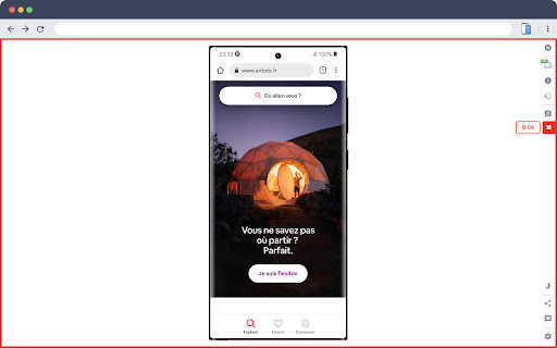
Phone Simulator — Mobile Emulator Tool
Try Phone Simulator: test your site on iPhone, iPad & Android - mobile emulator. Online mobile simulator & website viewer. Want to see your website on mobile the way real users do? Phone Simulator is a Chrome mobile view extension that lets you test your site on iPhone, iPad, Android phones and tablets - instantly, directly in your browser. No extra software, no physical devices needed. How to get started: 1. Click "Add to Chrome" to install Phone Simulator. 2. Open any website you want to preview. 3. Click the extension icon and choose a device. 4. Instantly see your website on mobile - switch devices with one click. Key features of Phone Simulator: 📱 Test your site on mobile with 60+ device presets - smartphones, tablets, laptops, and more. 🍎 iPhone simulator online - preview iPhone 17, iPhone 17 Pro, iPhone 16 and more. 🤖 Android emulator - Samsung Galaxy S26, Galaxy S25, Google Pixel, Xiaomi, and other popular models. 🛠️ iPad emulator and Android tablet presets with precise screen dimensions. 🔄 Screen rotation - switch between portrait and landscape instantly. 📸 Screenshot capture - save any device preview instantly with one click. 🎥 Video recording - record your screen and export it instantly. 🌗 Dark & light mode testing across all devices and screen sizes. 🎨 Realistic browser UI with accurate device frames. ⚡ Instant device switching - no reloads, no DevTools required. 🌎 Works on any website - React, Vue, Angular, Bootstrap, Tailwind CSS. Perfect for: - Web developers testing responsive CSS and layouts using a phone simulator app. - UI/UX designers building mobile-first and adaptive websites. - QA testers running cross-device compatibility checks. - Agencies presenting a mobile phone view of website to clients. - Frontend developers debugging breakpoints. 🖥️ Accurate mobile site viewer: Phone Simulator delivers real device viewport sizes, pixel ratios, and frames - so you can see your website exactly as real users do. No guessing, no approximations. Whether you need a quick phone simulator online check during development or a thorough mobile browser emulator for QA, this Chrome extension handles everything without leaving your browser tab. 📌 Supported device categories: 1️⃣ iPhone emulator - all major Apple iPhone models, from older to the latest releases. 2️⃣ iPad emulator - full iPad, iPad Air, and iPad Pro lineup. 3️⃣ Android phone simulator - Samsung Galaxy, Google Pixel, and more. 4️⃣ Android tablet emulator - popular Android tablet screen sizes. 5️⃣ Laptop simulator - MacBook and Windows laptop viewports. 🎯 Ideal for every use case: 🛠️ Development & testing - test responsive CSS, media queries, and breakpoints via mobile simulator extension without a physical device. 📐 Design review - preview layouts on a cell phone simulator before handoff and catch issues early. 🔍 QA & cross-device - run phone emulator checks across iPhone, Android, and tablet presets to find layout bugs before users do. 📊 Client presentations - let clients see website on mobile directly in Chrome, no extra tools needed. Why developers choose Phone Simulator: ➤ Works instantly - no Chrome DevTools needed. ➤ Accurate cell phone simulator - real device dimensions. ➤ Online mobile emulator - works on any public URL or localhost. ➤ One-click mobile view extension - enable or disable instantly. ➤ Regular updates with new device models. 💬 Frequently Asked Questions: ❓ What is Phone Simulator? 💡 Phone Simulator is a chrome mobile emulator extension that lets you view any website as it appears on iPhone, iPad, Android, and other devices - right inside your browser. ❓ How do I test my website view on mobile? 💡 Install the extension, open any website, click the icon, and select a device. Your mobile website viewer is ready instantly - no configuration needed. ❓ Is it a real phone emulator? 💡 Yes. Phone Simulator emulates real device viewports, user-agent headers, and pixel ratios, giving you a precise online mobile simulator experience inside Chrome. ❓ Does it work as an iPhone simulator online? 💡 Absolutely. Pick any iPhone model from the device list and instantly see your site on mobile with a realistic browser UI and accurate screen dimensions. ❓ Can I test on Android too? 💡 Yes - Android presets include Samsung Galaxy, Google Pixel, Xiaomi, Infinix, OnePlus, and more. Use it as an online phone simulator for any Android screen size. ❓ What makes it different from Chrome DevTools device mode? 💡 Phone Simulator adds realistic frames, a mobile browser UI overlay, one-click screenshot capture, and fast device switching - all without opening DevTools. 📌 No extra software. No configuration. Just click, pick a device, and see your website on mobile exactly as your users do. 👆 Click "Add to Chrome" and start mobile responsive testing right now.

Fake Filler
A form filler that fills all inputs on a page with fake/dummy data. Fake Filler is THE form filler to fill all input fields on a page with randomly generated fake data. This productivity boosting extension is a must for developers and testers who work with forms as it eliminates the need for manually entering values in fields. • Fill all inputs with randomly generated names, emails, phone numbers, etc. • Sensible defaults to allow you to start using the extension without any configuration. • Ignores CAPTCHA, hidden, disabled and readonly fields.

Mobile View: Test responsive designs fast
Test your responsive designs on multiple devices at once. See your website on multiple devices at once with live updates, even for locally hosted sites. Hot module reloading ensures instant code changes across all devices, while synchronised scrolling and navigation lets you test seamlessly across any website. Perfect for: ----- ✅ Full-Stack & Front-End Developers ✅ UX/UI Designers ✅ Anyone using Polypane/Blisk/Responsively/Sizzy Get started in seconds: ----- ✅ Install Mobile View from the Chrome Web Store. ✅ Click the extension icon to activate it. ✅ Select devices and breakpoints for continuous testing. ✅ Start developing - changes appear instantly! Join the future of responsive design testing and quality assurance. Works with all your favourite frameworks. Try Mobile View today and revolutionise your development process!