
pahjcficmhfgjkdcdadnacjdiinpilmd
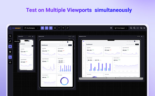


An essential tool to test the responsiveness of any website on multiple screens simultaneously Simplify your web development and testing journey with Responsive Website Testing Toolkit, a comprehensive solution built to enhance testing, collaboration, and project organization. An advanced multi-device responsiveness testing tool that empowers developers and designers to work smarter and faster. 1. Test Responsiveness Across Multiple Viewports Simultaneously Instantly preview your website on multiple devices in real time. Responsive Website Testing Toolkit lets you view layouts on smartphones, tablets, desktops, and more, helping you deliver pixel-perfect designs for every screen size. 2. Sync Mouse Clicks and Scroll Events Across Viewports Test interactivity like never before! Sync mouse clicks, and scroll events across all viewports simultaneously, ensuring a seamless user experience across devices. 3. Customizable Viewports for Every Need Design and test for any screen size with ease. ResponsiveSync Pro allows you to create custom viewports tailored to unique device requirements, giving you the flexibility to tackle any project. 4. Workspaces for Efficient Project Management Stay organized with dedicated workspaces for every project. Manage viewports, configurations in a single, user-friendly interface, making multi-project management a breeze. 5. Export and Import Projects and Settings Seamlessly collaborate with your team or transfer projects between environments. Responsive Website Testing Toolkit supports exporting and importing projects and settings, ensuring continuity and productivity across your workflow. 6. Capture Screenshots Instantly Document and share progress with one-click screenshot capabilities with or without the device Mockup. Besides above mentioned key features there are more features to explore. We are actively working to introduce new features in a regular interval and improve the quality of the application. ✅ Save Time: Simultaneous multi-device testing accelerates your workflow. ✅ Work Smart: Advanced features like synced actions and project exports boost efficiency. ✅ Be Flexible: Customize viewports and configurations to fit any requirement. ✅ Stay Organized: Streamline project management with intuitive workspaces. Take your responsive web development and testing to the next level with Responsive Website Testing Toolkit, the all-in-one tool that delivers precision, flexibility, and convenience. For any suggestions or feature request please reach out to us via the email which mentioned in the developer info.

SEO Buddy - On-Page SEO Analyser
A complete On-Page SEO tool to help you analyse your webpage and optimize it for better ranking SEO Buddy is a complete On-Page SEO tool to help you analyse your webpage and guide you to optimise it for better ranking. ✅ Analyse On-Page SEO: This extension analyse the existing On-Page SEO following good practices and get a performance score ✅ Reliable Benchmark: Most essential On-Page SEO conventions are used to calculate the score of your current On-Page SEO score. ✅ Checklist for Improvement: It suggests checklist containing best practices to improve the SEO ranking. ✅ Detail overview of each factors: All the best On-Page SEO practices are presented in a detail manner like External/Internal/ Broken Links, Images missing alt, useful integrations etc. ✅ Technologies Detection: It has technology detection feature like Built-With and Wappalyzer to detect which technologies are being used on the webpage. ✅ Super fast and efficient: On-Page SEO analysis are done very efficiently within seconds ensuring reliable results. ✅ Clean and User friendly UI/UX: Ensuring a great experience is important to us. In every aspects we tried to guide the user through as less cluttered informations as possible. Besides all the above mentioned features, we are actively working bringing newer features. If you have questions, concerns or feature request, please send an email to rahulbaruri1@gmail.com. We will to reply you as early as possible.

Clean Reader - Read without distractions
An essential reading assistant tool that ensures ad free and enjoyable reading experience This extension ensures the ad free and distraction free reading experience. Users can concentrate on reading without being distracted by annoying ads, popups and banners. Main features: - Creates the Ad free, distraction free a clean article or blog post - Users can configure text such as font family, font size and alignment - Both Light and dark theme are supported based on the users preference - Offers text highlighting with different colours - Clean User interface and Typography - We are working on bringing some exciting features in upcoming days

Viewport Resizer: Ultimate Device Emulator & Website Testing Tool
Emulate devices, resize screens, and perfect your web design effortlessly with this cutting-edge testing and presentation tool. Enhance your web design experience with our dynamic testing and presentation tool, designed to create, test, and showcase your digital experiences on any device, from wearables to very big screens. Customize your workspace fully and use or create your own device mockups, explore various display resolutions, and harness advanced emulation features like touch fingerprint simulation, user-agent emulation, and breakpoint guide, all within a professional-grade environment built for high-quality development and debugging. Push your limits with an intuitive zoomable workspace, precise ruler and grid tools, and a sleek presentation mode called 'Coffee Mode' — think of this tool as a first-level approximation of how your digital experience looks and feels across multiple devices. Limitations: While our tool provides comprehensive device simulations, it does not replace the need for physical device testing.

Smart Color Picker and Palettes
An extension to get the color code of any pixel on the web page. It also offers trendy color palettes and css gradients The Smart Color Palette is a great extension that provides the list of used colors used on any webpage along with Eye Dropper tool to grab any color. Users can find lot of popular and most trendy color palettes and css gradients. ✅ Grab any color with the new color picker or Eye Dropper tool ✅ See all the colors are used in any webpage ✅ Provides trendy CSS Gradients ✅ Get tons of popular and elegant color palettes ✅ Get standard and Web safe color codes ✅ Create a lot of your own color palettes with an amazing color picker ✅ Cool User interface Developed with ❤️ by Rahul Baruri