
kkelicaakdanhinjdeammmilcgefonfh

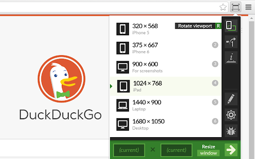

Resize the browser window to emulate various screen resolutions. This extension re-sizes the browser's window in order to emulate various resolutions. It is particularly useful for web designers and developers by helping them test their layouts on different browser resolutions. The resolutions list is completely customizable (add/delete/re-order). You can set the window's width/height, window's position, preset icon (phone, tablet, laptop, desktop) and even the option to apply the new dimensions to the entire window or just to the viewport. The extension also features customizable global key shortcuts, an option to export your settings and import them on another computer and more! Please report all bugs (or suggestions) using the support link on the extension's details page.

Responsive Viewer
A Chrome extension to show multiple screens in one view. the extension will help front-end developers to test multiple screens while developing responsive websites/applications. Clarification on privacy: This extension does not collect, store, or track any of your personal data. Your privacy is fully respected.

Grid Ruler
Create grids and measure their distance easily. It allows web developers to create vertical and horizontal grids, Photoshop style. It has a ruler to measure distance between your grids too. - click & drag from main vertical/horizontal ruler to create grid guides. - click on intersection of vertical ruler and horizontal ruler to go into measurement mode. - while in measurement mode, hold `Shift` key to get a straight line.

Muzli - Design inspiration hub
Your daily dose of design with industry news, tools, and inspiration - all in one place. Muzli takes the center stage as it replaces your default tab and becomes your simple and beautiful design oriented home page. Loved by hundreds of thousands designers worldwide, Muzli is the leading go-to browser extension for creative professionals. Once installed, Muzli becomes your visual hub for the latest and most cutting-edge Design, UI, UX, and interactive content. It serves daily content from all major design and inspiration sources that ensures you will never miss the next big thing. Plus, our hand-picked, professionally curated "Muzli Picks" journal ensures you're treated to the crème de la crème of design inspiration. You can always make Muzli personalised, by choosing from over 160+ creative design sources that cater to your unique interests, so you can always find the content that resonates with you the most. We always try to deliver a design-centric browsing experience that ensures you will always keep up with the creative realm and make your exportations feel seamless.

Site Palette
Site Palette now has an official Figma plugin. Import your saved palettes directly into Figma as local variables, no copy-paste of hex codes: https://www.figma.com/community/plugin/1631159048065020915/site-palette Now available for Microsoft Edge, Brave, and Opera via Chrome Web Store. Site Palette is a color palette extractor for designers and front-end developers. Install the extension, visit any website, click the icon in your toolbar, and instantly get an accurate palette of the colors that page actually uses. Save it to your account, share it via a unique link, or export to Figma, Sketch, Adobe Swatch, or SVG. Unlike eyedropper tools that pick one color at a time, Site Palette analyses the full page and returns a coherent palette using multiple algorithms: Color Cube, Median Cut, Material Design mode, and live viewport extraction ranked by on-screen area. Every palette you generate is saved to your personal history and synced across devices. - Multiple extraction algorithms: Color Cube, Median Cut, Material Design, live viewport - Figma plugin with palettes synced as local variables, ready for tokens and themes - Sketch template, Adobe Swatch (.ase), and SVG export - Google Art Palette and Coolors.co integration for fine-tuning - MagicLink sign-in, no passwords - Personal Palette History with unique shareable links - Manage subscription from My Profile - Competitor color audits: compare 10 sites side by side in minutes - Brand discovery: capture a client's existing palette before a rebrand - Design system seeding: bootstrap new files with real-world references - Mood boards: pull colors from any visual reference