
inmopeiepgfljkpkidclfgbgbmfcennb


A Chrome extension to show multiple screens in one view. the extension will help front-end developers to test multiple screens while developing responsive websites/applications. Clarification on privacy: This extension does not collect, store, or track any of your personal data. Your privacy is fully respected.

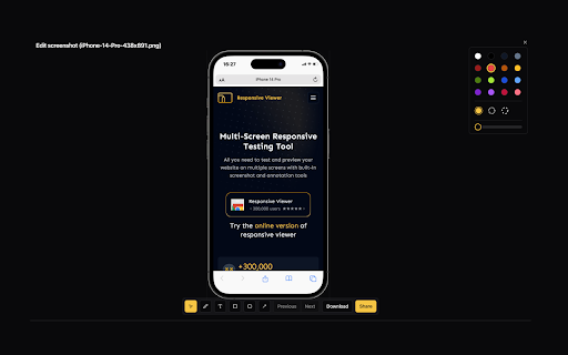
Pixefy - Responsive Design Checker
Preview and debug your website’s responsiveness across multiple devices in real-time, all inside one browser tab. Pixefy helps you spot layout issues instantly and fine-tune designs with live editing tools – right as you build. It simplifies responsive testing by letting you preview, debug, and edit across multiple screen sizes in one place – no more switching tabs or resizing windows manually. ✔️ 🟢🟠 Live Responsive Previews – Test across multiple screen sizes side-by-side. Scroll, click, and interact on all screens simultaneously. Match real devices with optional browser bars + native UI spacing. ✔️ 🟠 Custom Screens & Presets – Create and save your own breakpoints, or use popular device resolutions out of the box. ✔️ 🟢 Screen Management – Rearrange, stack (horizontal/vertical), rotate, or zoom screens globally for a flexible workspace. ✔️ 🟢🟠 Inspect & X-Ray – Inspect styles, edit attributes live, and debug layouts with Visual Box Model, grids, and X-Ray overlays. ✔️ 🟢🟠 CSS Debugging Tools – View/edit computed styles, measure distances between elements, compare two elements, and track all changes in the Activity Tab. ✔️ 🟠 Content Editing – Instantly replace text or images, and check word/character counts directly on the page. ✔️ 🟠 Asset Downloads – Extract SVGs, PNGs, and other assets directly from Inspect Tool tabs. ✔️ 🟢 Screenshots & Annotations – Capture full pages, visible areas, or selected regions, then add notes, arrows, and highlights for clear, shareable feedback. ✔️ 🟠 User Agent Switching – Simulate different devices, browsers, or bots to see how your site adapts. ✔️ 🟠 Accessibility Tools – Test AA/AAA contrast ratios, extract all colors, and preview vision impairments with blindness simulations. ✔️ 🟢 Utilities – Live Dimension Widget (viewport width/height), copy any value or asset to clipboard, clear cache & refresh Pixefy. ✔️ 🟠 Themes – Switch between website's light and dark mode instantly. ✔️ 🟠 SEO Overview – Get a quick overview of key on-page SEO elements, including titles, meta descriptions, headings, and other essential page data. ✔️ 🟢 Touch Simulation – Simulate touch interactions to preview how websites behave on touch-based devices.

Mobile View: Test responsive designs fast
Test your responsive designs on multiple devices at once. See your website on multiple devices at once with live updates, even for locally hosted sites. Hot module reloading ensures instant code changes across all devices, while synchronised scrolling and navigation lets you test seamlessly across any website. Perfect for: ----- ✅ Full-Stack & Front-End Developers ✅ UX/UI Designers ✅ Anyone using Polypane/Blisk/Responsively/Sizzy Get started in seconds: ----- ✅ Install Mobile View from the Chrome Web Store. ✅ Click the extension icon to activate it. ✅ Select devices and breakpoints for continuous testing. ✅ Start developing - changes appear instantly! Join the future of responsive design testing and quality assurance. Works with all your favourite frameworks. Try Mobile View today and revolutionise your development process!

VisBug
Open source web design debug tools built with JavaScript: a FireBug for designers. - Point, click, move, resize & tinker - Edit or style any page, in any state, like it's an artboard - Inspect styles, spacing, distance, accessibility and alignment - Nitpick layouts & content, in the real end environment, at any device size - Leverage adobe/sketch skills - Edit text, replace images - Design within the chaos: use production or prototypes and the odd states they produce, as artboards and design opportunities - Design while DevTools simulates latency, i18n, media queries, platform constraints, CPUs, screensize, etc - Make more decisions on the front end of your site/app (a11y, responsive, edge cases, etc) - No waiting for developers to expose their legos, just go direct and edit the end state (regardless of framework) and execute/test an idea Give power to designers & content creators, in a place where they currently feel they have little to none, **by bringing design tool interactions and hotkeys to the browser**

Window Resizer
Resize the browser window to emulate various screen resolutions. This extension re-sizes the browser's window in order to emulate various resolutions. It is particularly useful for web designers and developers by helping them test their layouts on different browser resolutions. The resolutions list is completely customizable (add/delete/re-order). You can set the window's width/height, window's position, preset icon (phone, tablet, laptop, desktop) and even the option to apply the new dimensions to the entire window or just to the viewport. The extension also features customizable global key shortcuts, an option to export your settings and import them on another computer and more! Please report all bugs (or suggestions) using the support link on the extension's details page.