
iacpblbgooifgclhbdcaonebhoadpmgj

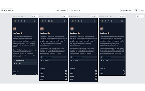
Test sites on multiple devices in one tab. Improve development, UI/UX, & QA with live previews. Simulate your website across various devices concurrently, all within a single tab. This comprehensive tool aims to streamline the development process, enhance user interface and experience, and bolster quality assurance. ✨Key Features: ♦️ Multi-Device Simulation: Test your website on multiple devices simultaneously, saving time and effort. ♦️ Real-Time Previews: Experience live, responsive previews aiding in UI/UX optimization. ♦️ Comprehensive Development Support: Boost your development cycle efficiency. ♦️ Quality Assurance Enhancement: Ensure your site is top-notch across different platforms and screen sizes. ✨Benefits: ♦️ Efficiency: Save time by testing on various devices without switching tabs or tools. ♦️ Accuracy: Real-time previews ensure a precise understanding of how the site looks and functions. ♦️ Optimization: Improve user experience by identifying and addressing UI/UX issues promptly. ♦️ Reliability: Enhanced quality assurance ensures a consistent experience for all users.

Mobile simulator - responsive testing tool
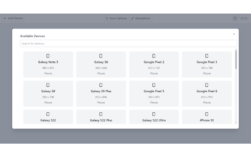
Smartphone and tablet simulator on computer with several models to test mobile responsive websites. 🚀 Simulate mobile viewports, check responsive web design, create impactful client demos, and save hours of testing. Mobile FIRST is the most powerful and reliable responsive simulator extension, trusted by developers and designers for over 5 years. Our rating on the Chrome Store speaks for itself! 📱 PRE-CONFIGURED DEVICES (New ones added regularly) • 58+ devices ready to use out of the box • 45 smartphones (old and recent models) • 5 tablet models • 11 special devices (smartwatches, kiosks, desktop...) 🔥 NEW & MAIN FEATURES • 📱📱 Multi-device comparison: View and test multiple devices side-by-side simultaneously for faster responsive checks • 🛠️ Custom devices: Create and save your own devices with custom screen resolutions and viewports • 👆 Realistic touch scrolling: Simulates native finger gestures for an authentic mobile browsing feel • 🎬 One-click video capture (WEBM, GIF, MP4) for your demos and tutorials • 📸 Transparent PNG screenshots, perfect for client emails or presentations • 🌚 Dark mode for enhanced visual comfort ✨ Inside Mobile FIRST, many technical tricks are integrated to reproduce the mobile experience as closely as possible. (Note: While highly accurate for day-to-day dev, this simulator does not replace final testing on a real device for 100% full validation.)

Device Simulator
This Chrome extension simulates the web app environments (User Agent and required APIs) of video streaming devices like set-top boxes, Tizen, PS WebMaf. It can be used for developers to use their desktop browsers to test web applications developed for those devices. When you have selected a simulator for a loaded URL for the first time, it remembers your selection, and use the selection next time automatically.

Responsive Website Testing Toolkit - Multiple Viewport Simulator
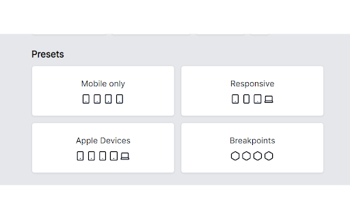
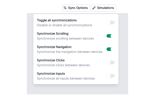
An essential tool to test the responsiveness of any website on multiple screens simultaneously Simplify your web development and testing journey with Responsive Website Testing Toolkit, a comprehensive solution built to enhance testing, collaboration, and project organization. An advanced multi-device responsiveness testing tool that empowers developers and designers to work smarter and faster. 1. Test Responsiveness Across Multiple Viewports Simultaneously Instantly preview your website on multiple devices in real time. Responsive Website Testing Toolkit lets you view layouts on smartphones, tablets, desktops, and more, helping you deliver pixel-perfect designs for every screen size. 2. Sync Mouse Clicks and Scroll Events Across Viewports Test interactivity like never before! Sync mouse clicks, and scroll events across all viewports simultaneously, ensuring a seamless user experience across devices. 3. Customizable Viewports for Every Need Design and test for any screen size with ease. ResponsiveSync Pro allows you to create custom viewports tailored to unique device requirements, giving you the flexibility to tackle any project. 4. Workspaces for Efficient Project Management Stay organized with dedicated workspaces for every project. Manage viewports, configurations in a single, user-friendly interface, making multi-project management a breeze. 5. Export and Import Projects and Settings Seamlessly collaborate with your team or transfer projects between environments. Responsive Website Testing Toolkit supports exporting and importing projects and settings, ensuring continuity and productivity across your workflow. 6. Capture Screenshots Instantly Document and share progress with one-click screenshot capabilities with or without the device Mockup. Besides above mentioned key features there are more features to explore. We are actively working to introduce new features in a regular interval and improve the quality of the application. ✅ Save Time: Simultaneous multi-device testing accelerates your workflow. ✅ Work Smart: Advanced features like synced actions and project exports boost efficiency. ✅ Be Flexible: Customize viewports and configurations to fit any requirement. ✅ Stay Organized: Streamline project management with intuitive workspaces. Take your responsive web development and testing to the next level with Responsive Website Testing Toolkit, the all-in-one tool that delivers precision, flexibility, and convenience. For any suggestions or feature request please reach out to us via the email which mentioned in the developer info.

Free Mobile Simulatore - Responsiveness testing
Simulate mobile, tab and pc to test responsive website for free. 🚀 Preview your website on real mobile and tablet devices — right from your desktop! Say goodbye to resizing your browser or juggling multiple devices. With Mobile Simulator – Responsiveness Testing, you can instantly see how your website looks and behaves across a wide range of smartphones and tablets — all within your Chrome browser. This powerful extension gives you a realistic, side-by-side view of popular mobile devices like iPhones, Samsung Galaxy, iPads, and more. Perfect for developers, designers, testers, or anyone building a mobile-friendly site. 🔧 Features you’ll love: 📱 Multiple device models – iPhone, Android, iPad, and more 🎯 Pixel-perfect simulations with accurate resolutions Whether you’re fixing a bug, refining a layout, or launching something new, this extension helps you spot issues fast and build better user experiences for every screen size. 🌐 Responsive design matters. Over 60% of users browse on mobile — if your site isn’t optimized, you’re losing visitors. 🔥 Start testing smarter. Install Mobile Simulator – Responsiveness Testing now and see your site through your users’ eyes.