
bmhfelbhbkeoldaiphchjibggnoodpcj

Switch to mobile view with one click via toolbar button. Mobile View Switcher is a lite extension that let you switch a website to mobile view. Default mobile view is iPhone with iOS 15 but you can change it from the options page. Simply add a desired user-agent to change the mobile view to your desired one. There are many websites that offer user-agent strings for various devices. Simply copy and paste the desired one in the designated area in options page. Then reload any website to see the mobile view UI (while the addon is active). Toolbar button serves as ON|OFF switch to enable or disable the addon. Grey color for toolbar icon is when the addon is inactive and yellow color is for the active state. Simply click on the toolbar icon to switch states. To report bugs, please fill the bug report form in the addon's homepage (https://mybrowseraddon.com/mobile-view-switcher.html).

Breeze: Website Management Tool
All-in-one tools for website migration project, operating website and SEO tools. Welcome to Breeze: The All-In-One Chrome Extension for Website Management If you manage websites, it's time to declutter your extensions and simplify your workflow with Breeze.bar. This chrome extension is packed with essential tools for managing everything from website structure to SEO, all in one place. Whether you're clearing cache, editing live text, or checking meta descriptions, Breeze makes it easy. Out of the Box with Breeze: Clear Cache & Cookies: The clear cache extension helps you clear cookies, local storage, and cache—either for a specific website or across your entire browser. Choose from custom time ranges like "Last Hour," "7 Days," or "All Time." SEO Panel: Easily check the meta title and meta description of any website, with a character count feature to ensure they fit Google’s standards. Ideal for content managers and marketers who need to review titles without using complex tools. Download Media: Download images, videos, fonts, and brand colors directly from a webpage. The tool even lets you extract SVG icons and hosted MP4 files (except from YouTube). Mobile View Switcher: Quickly toggle between mobile and desktop views without resizing your browser window. This feature allows you to check website responsiveness across multiple breakpoints, ensuring your site is optimized for different devices. LiveEdit: Edit visible text and see changes in real-time without needing CMS access. Perfect for testing content updates before going live. Take Screenshots + Annotate: Capture full-page or focused screenshots and add annotations. Developers will love the added debug info, including page size, resolution, and more. Cookie & Cache Clear Extension The Breeze clear cache chrome extension lets you remove cookies, cache, and local data with a single click. Whether you're troubleshooting a website or performing GDPR compliance checks, Breeze gives you full control over what’s stored on your browser. You can even export cookies as a CSV, Excel, or PDF file to document the dropped cookies for compliance purposes. SEO Information at Your Fingertips Forget about diving into source code or using expensive SEO tools to check page titles or descriptions. Breeze’s meta title checker and meta description checker let you see on-page SEO instantly. Plus, a handy character count tool ensures your meta tags won’t get cut off in Google search results. Download Media from Web Pages No need for separate tools to download media files. With Breeze, you can grab images, videos, and icons directly from any page. Whether it's a JPG, PNG, SVG, or hosted MP4, Breeze makes downloading media a breeze (pun intended!). Mobile Responsive Layout Checker Test how your website looks across devices with the mobile view extension. You can toggle between desktop and mobile views to check layout responsiveness without needing access to physical devices. Future updates will include Google Analytics data for top device sizes, making it even easier to optimize your site. LiveEdit: Edit Text on Any Page For marketers and content editors, the LiveEdit feature is a game-changer. Edit visible text on any page without logging into a CMS. Once you're happy with the changes, share the updated content with developers to implement. Plus, Breeze’s built-in page grid outlines the structure of your page, ensuring every element is perfectly aligned. Screenshot + Debug Information for Developers Go beyond a simple screenshot with Breeze's screenshot tool. Capture the entire page or a specific area, and add annotations such as arrows, numbers, or text. Share detailed debug info, including page size, resolution, and browser data to help your development team address any issues quickly. Breeze Chrome Extension: Key Features Clear Cookies & Cache: Efficiently clear browser data, including specific cookies, cache, and local storage. SEO Panel: Instantly check meta titles, meta descriptions, and character limits. Media Download: Download images, videos, fonts, and brand colors directly from the webpage. Mobile View Switcher: Test website responsiveness across different breakpoints. LiveEdit: Visually edit webpage text without CMS access. Screenshot Tool: Take annotated screenshots with debug information for developers. Why Choose Breeze? With Breeze, you don’t need multiple extensions cluttering your toolbar. From clearing cookies and cache to checking website meta data, Breeze is the ultimate chrome extension for website management. Plus, with additional features like LiveEdit and the mobile view switcher, it’s built for marketing and non-technical teams—but even developers will appreciate its versatility. Breeze is the only website migration and operation tool designed specifically for agencies and marketing teams, helping you stay productive and ahead of the curve. Get Started with Breeze Visit www.breeze.bar to learn more and start managing your websites with ease. Don't forget to install the clear cache extension and mobile view extension for an all-in-one solution.

Page to Popup
See your desired website in the toolbar popup. With the Page to Popup extension, you can easily see your desired website in the browser's toolbar popup (mobile or desktop views). Once the addon is installed, please open the options page and add the desired website (the complete URL). One desktop view and five different mobile views are available to choose from (iOS, Android, Windows Phone, Tizen, and Firefox OS). You can also adjust the popup size (width and height) and block ads within the popup. To report bugs, please fill out the bug report form on the addon's homepage (https://mybrowseraddon.com/site-to-panel.html).

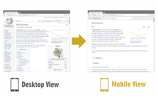
Responsive Tester
Test responsive web designs or mobile pages and see if it is mobile friendly Test responsive web designs or mobile pages that detect specific user agents. Test multiple devices at the same time! The Mobile/Responsive Tester extension allows Developers to test their web pages against common mobile, phablet and tablet devices by emulating the user agent and screen resolution. Excellent for testing responsive web designs. Easily switch between portrait and landscape mode and test multiple mobile device's at the same time! To begin using the software, install our extension. Navigate to the webpage you wish to test for different resolution sizes. Click on our software extension icon, and then choose the resolution size.

Viewport Resizer: Ultimate Device Emulator & Website Testing Tool
Emulate devices, resize screens, and perfect your web design effortlessly with this cutting-edge testing and presentation tool. Enhance your web design experience with our dynamic testing and presentation tool, designed to create, test, and showcase your digital experiences on any device, from wearables to very big screens. Customize your workspace fully and use or create your own device mockups, explore various display resolutions, and harness advanced emulation features like touch fingerprint simulation, user-agent emulation, and breakpoint guide, all within a professional-grade environment built for high-quality development and debugging. Push your limits with an intuitive zoomable workspace, precise ruler and grid tools, and a sleek presentation mode called 'Coffee Mode' — think of this tool as a first-level approximation of how your digital experience looks and feels across multiple devices. Limitations: While our tool provides comprehensive device simulations, it does not replace the need for physical device testing.