
ohfappdhdoofhbiajcdakoicdpfpkggn
Make any non-mobile website to MOBILE in ONE click Make Any website to mobile view in ONE click is open source

Mobile View Switcher
Switch to mobile view with one click via toolbar button. Mobile View Switcher is a lite extension that let you switch a website to mobile view. Default mobile view is iPhone with iOS 15 but you can change it from the options page. Simply add a desired user-agent to change the mobile view to your desired one. There are many websites that offer user-agent strings for various devices. Simply copy and paste the desired one in the designated area in options page. Then reload any website to see the mobile view UI (while the addon is active). Toolbar button serves as ON|OFF switch to enable or disable the addon. Grey color for toolbar icon is when the addon is inactive and yellow color is for the active state. Simply click on the toolbar icon to switch states. To report bugs, please fill the bug report form in the addon's homepage (https://mybrowseraddon.com/mobile-view-switcher.html).

Switch to Mobile View
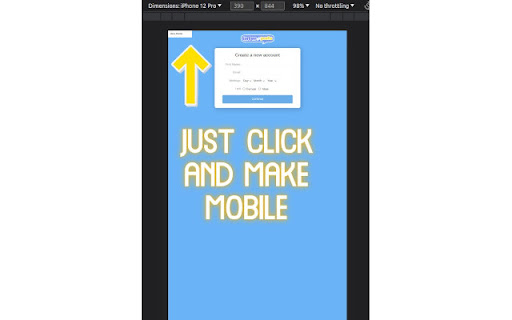
One click mobile viewport preview for any page. Modern web audiences don’t sit still. They bounce from 27-inch monitors at work to pocket-sized screens on the train, and they expect every site to feel tailor-made for both. For designers, developers, marketers, and even everyday power users, that raises a daily question: “How will this page look on a real phone?” Chrome’s own DevTools can answer it—after you dig through menus, panels, and a thicket of device frames. Switch to Mobile View shrinks that journey to a single click or shortcut, Tap the toolbar icon (or press Alt + M) and the current page is instantly constrained to a handset-sized viewport. A soft grey backdrop isolates the page from the rest of the browser window, making your content the star while visually reminding you that Mobile View is active. A small badge hovers in the corner displaying the current device preset—starting with iPhone 14, The extension ships with three of the most commonly requested breakpoints—iPhone 14 (390 × 844 px), Pixel 7 (412 × 915 px), and iPad mini (768 × 1024 px). Each preset adjusts the meta viewport tag, element widths, and scroll behaviour to mimic the feel of the chosen device. Quality-assurance teams can script keyboard shortcuts into automated test suites for faster responsive testing. Content creators and marketers preview newsletters, landing pages, and social embeds to ensure legibility on small screens. Educators and students exploring responsive design concepts get an approachable, permission-safe sandbox. Whether you are fine-tuning a checkout flow minutes before launch or teaching a classroom full of aspiring developers, this extension slots into your workflow with almost zero learning curve.

Instant Mobile Preview - Side Panel View
Side Panel Mobile View is a simple Chrome extension designed to streamline mobile testing and boost web development productivity. With this tool, you can instantly view a side-by-side mobile version of any website directly within your browser. By leveraging built-in device emulation, the extension provides an accurate website mobile view that helps you test mobile responsiveness, analyze design elements, and perform competitive research with ease. Note: Does not work for some websites due to Content Security Policies (CSP) including X/Twitter and Facebook. 🚀 Key Features & Benefits Instant Mobile Testing: Quickly switch to a mobile preview without leaving your current webpage. The extension seamlessly opens a side panel, allowing you to view and test the mobile version of any website side-by-side with its desktop counterpart. This real-time mobile responsiveness testing saves time and streamlines your workflow. Enhanced Mobile Responsiveness: Use built-in device emulation to render an accurate mobile view. Ensure your website looks great on smartphones by checking its layout, functionality, and performance as you make design updates. Ideal for developers, UX/UI designers, and product managers aiming to perfect their mobile experience. User-Friendly Interface: The extension offers a minimalistic and intuitive design. Activate the mobile view easily via the Chrome toolbar icon or by right-clicking on a webpage and selecting “See Mobile View.” With independent scrolling in the mobile preview, you can inspect every detail without interference. Optimized for Performance: Engineered to be lightweight and fast, Side Panel Mobile View ensures that your browser remains responsive. The mobile view loads within seconds, providing an efficient tool for on-the-fly mobile testing and rapid iterations. ✅ Why Install Side Panel Mobile View? Streamline Your Workflow: Eliminate the need to switch between tabs or external devices for mobile testing. With a single click, get an immediate mobile preview right inside your Chrome browser. Improve Mobile Responsiveness: Ensure your websites meet high standards of mobile responsiveness by testing designs in real time. Detect and resolve issues early, leading to a smoother user experience across all devices. Boost Productivity: Designed with efficiency in mind, this extension minimizes load times and resource usage while providing comprehensive mobile view capabilities. Spend less time configuring setups and more time perfecting your designs. Optimized for Web Professionals: Whether you're a developer, designer, or product manager, Side Panel Mobile View delivers the insights you need to create engaging, responsive web experiences. It’s the perfect tool for competitive research, responsive design testing, and on-the-go mobile previewing. ✨ Perfect for: Web Developers UX/UI Designers Product Managers Quality Assurance Teams Keywords: mobile responsiveness, mobile testing, website mobile view, responsive design, device emulation, mobile preview, web development, Chrome extension, mobile web, UX/UI design, competitive research, performance testing Get Started Today: Transform the way you test and optimize mobile web experiences. Install Side Panel Mobile View from the Chrome Web Store and leave us feedback!

Mobile Design for Social Network Sites
Modify mobile version of facebook design while using it on your desktop. How to use this? Just install the extension and done! Note: This extension isn't associated with Meta nor Facebook. 1. Facebook Messenger message status By turning off your active status in facebook + using m.facebook.com. Senders will not be informed that their messages are already *delivered* to you. So that they will think that you're offline 🙂. 2. Save data By minimal image and less functionality, you can save up data or even browse faster if your internet is like a 🐌 3. Layout revamped Since the m.facebook.com is for mobile and you/we are using desktop, the layout will be huge to the point that fill your screen and be annoying, and that's one of the reason why this extension exist, to fix it.