
ddfcjnekgmblacbpifjdmcbbhfcdekic
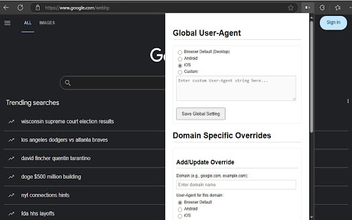
Switch user agent to simulate mobile (Android/iOS). Test mobile views, access content and save bandwidth. Easily Test Mobile Views and Access Device-Specific Content with Mobile View Switcher! Ever needed to see how a website looks on an Android phone or an iPhone? Want to access content that's only available to mobile users or test your website's responsiveness? Mobile View Switcher gives you the power to change how your browser identifies itself to websites by modifying the User-Agent string. Simulate Mobile Devices: Quickly switch your browser's User-Agent to popular mobile profiles like Android or iOS with built-in presets, or define your own custom User-Agent string [cite: uploaded:mobileview/options.js]. Global Control: Set a single User-Agent that applies to all websites you visit. Choose a mobile profile, a custom one, or easily revert to your browser's default [cite: uploaded:mobileview/options.js]. Per-Domain Overrides: Need more granularity? Configure specific User-Agents for individual websites. For example, make example.com load as an iPhone while google.com loads as Android, and let all other sites use your global setting or the browser default [cite: uploaded:mobileview/options.js, uploaded:mobileview/background.js]. Simple Configuration: Manage all your global settings and domain overrides through a clear and easy-to-use options page [cite: uploaded:mobileview/options.html]. Why Use Mobile View Switcher? Web Development & Testing: Essential tool for developers and designers to preview and test how websites render on different mobile devices. Access Mobile-Only Content: Some websites offer different features or layouts for mobile users; this extension helps you access them from your desktop. Potential Bandwidth Savings: By requesting lighter, mobile-optimized versions of websites, you may potentially use less data on some sites (though this depends on how the site is built). Mobile View Switcher uses the modern and efficient declarativeNetRequest API [cite: uploaded:mobileview/background.js], ensuring minimal impact on your browser's performance and privacy by modifying headers without needing to read website content. Install Mobile View Switcher today and take control of your browser's identity!

Temporary Mobile View
View current page in the mobile-friendly format by spoofing Android or iOS user-agent string on request header and JavaScript sides This extension toggles a website's view to its mobile version if the server supports a mobile-friendly option. Please note that this change is temporary, and you can return to the default desktop view by clicking the action button once more. Additionally, you can select different devices, such as Android, iOS, and Kindle, from the right-click context menu. The user-agent string for each device can be configured on the options page. Important Points: 1. To revert to the regular mode, click the browser's action button. 2. To switch between view modes, use the right-click context menu options. 3. Some websites employ distinct URLs for their mobile-friendly versions, often redirecting users to the mobile version (e.g., en.wikipedia.org => en.m.wikipedia.org). In such cases, even after a refresh, you will remain on the mobile-friendly hostname. Be sure to correct the address in the address bar before refreshing the page.

Mobile View Switcher
Use this chrome extension to switch to mobile view instantly with a single click. Tired of struggling to get the perfect mobile view? Searching for a quick way to test your website’s mobile responsiveness? Look no further! Mobile View Switcher chrome extension is your lifeline, transforming any website into a mobile view with just one click. No more wasting time fiddling with dev tools or resizing your browser—finally, see your site as users do on mobile 📱 Supports various mobile screen sizes and devices ⚡ Fast and lightweight Chrome extension 👩💻 Ideal for developers, testers, and designers 1. Install & Pin the Extension Add the Mobile View Switcher extension from the Chrome Web Store and pin it to your Chrome toolbar for quick access. Go to Google and search for anything—for example, “cat”—to open a standard web page. Right-click anywhere on the page, choose Inspect, then go to the Console tab, and type (navigator.userAgent) There, you’ll find your browser’s user agent. Copy it. For example, it might look like this: Mozilla/5.0 (Windows NT 10.0; Win64; x64) AppleWebKit/537.36 (KHTML, like Gecko) Chrome/135.0.0.0 Safari/537.36 4. Paste into Extension Popup Click on the extension icon. A pop-up will appear asking for a user agent. Paste the copied user agent into the provided field. Once you paste the user agent, the page will switch to mobile view mode. The extension is now ready to use. It saves time by instantly showing how a website looks on mobile. Great for quick previews, design checks, and mobile-friendly testing. Ideal for web developers, designers, marketers, and QA testers who work with mobile-responsive websites.

Mobile View Switcher
Switch to mobile view with one click via toolbar button. Mobile View Switcher is a lite extension that let you switch a website to mobile view. Default mobile view is iPhone with iOS 15 but you can change it from the options page. Simply add a desired user-agent to change the mobile view to your desired one. There are many websites that offer user-agent strings for various devices. Simply copy and paste the desired one in the designated area in options page. Then reload any website to see the mobile view UI (while the addon is active). Toolbar button serves as ON|OFF switch to enable or disable the addon. Grey color for toolbar icon is when the addon is inactive and yellow color is for the active state. Simply click on the toolbar icon to switch states. To report bugs, please fill the bug report form in the addon's homepage (https://mybrowseraddon.com/mobile-view-switcher.html).

Simple Mobile View
Simulate the mobile display for a webpage. Simulate the mobile view of any website in just one click. This extension allows you to preview any web page as if you were browsing from a smartphone. Perfect for developers, designers, testers, or anyone looking to check mobile rendering without complex tools. Choose from multiple devices: iPhone 16, Galaxy S24, Pixel, and more 🆓 Full free version for simple use 🚀 Save time and improve your mobile workflow today!